Did you know a well-designed website homepage can boost user engagement by up to 200%1? Creating engaging layouts for website sections is key in today’s digital world. Users want seamless experiences and quick results. This article will cover the basics and best practices for designing sections that grab your audience’s attention and help your business goals.
Designing an effective website means thinking about its layout and structure. The homepage is often the first and most important point of contact. It should introduce your organization’s purpose, show interesting content, and encourage visitors to act.
Key Takeaways
- Effective website section design can increase user engagement by up to 200%.
- The homepage is a critical touchpoint that sets the tone for the user experience.
- Crafting engaging layouts requires following design principles like clarity, simplicity, and visual hierarchy.
- Responsive and mobile-friendly design is essential for delivering a seamless experience across devices.
- Incorporating data visualization and impactful visuals can enhance the user’s understanding and retention.
Introduction to Website Section Design
Creating a great website starts with good section design. This part of the website is key for guiding visitors and sharing important messages. It also helps users take the actions you want them to2.
Importance of Effective Layout Design
A good website layout is like a map for users. It shows them how to move around and find what they need. A clear and simple design helps users quickly get what they’re looking for and do what they need to do3.
Key Elements of Website Section Design
- Header: The top section that typically includes the logo, navigation menu, and other key elements.
- Navigation: The menu system that lets users explore the website.
- Content Areas: The main sections where the website’s main content is shown.
- Sidebars: Areas that have extra information, calls-to-action, or links.
- Footer: The bottom section with contact info, legal stuff, and more navigation.
These elements work together to make a website easy to use. They help the website meet its purpose and show off its brand4.
“Effective website section design is the foundation upon which the entire user experience is built.”
Principles of Effective Website Section Design
Making website sections engaging and easy to use is key for a great online experience. Good design follows a few main principles. These help make websites easy to use and understand.
Clarity and Simplicity
Good website design focuses on being clear and simple. The layout should be straightforward, with important info easy to find5. Dashboards show data in a simple way, like car dashboards show important info quickly5.
The design of dashboards has changed over time. In the 1970s, they aimed to boost profits. By the 2000s, they became easier to use5. A study by the Nielsen Norman Group found that users leave complex or slow dashboards. This shows how important it is to keep designs simple and fast5.
Good dashboards make complex info easy to understand. They have a clean look, focus on key indicators, and use visual tools to show data.
Visual Hierarchy
A clear visual hierarchy in website sections guides users to important content and actions6. Badly designed dashboards can’t share useful info6. A good dashboard should show important info in about 5 seconds6.
Each dashboard should have 5-9 visualizations for easy understanding. Our brains can handle about 7+-2 images at once6. Choosing the right data visualization is key for clear communication. Designing dashboards for specific needs helps users make better decisions6.
The inverted pyramid layout helps users understand better. It puts key insights at the top, trends in the middle, and details at the bottom.
Consistent Branding
Keeping branding consistent in website design strengthens the company’s image and makes visits smooth7. Tech companies use interactive dashboards to track performance and improve strategies7. Business Intelligence (BI) dashboards aim to make complex info clear, empower decision-makers, and offer insights for smart choices7.
BI dashboards help spot trends, leading to better efficiency. Making decisions with accurate data boosts success7. Real-time data access and interactive tools make data easier to understand and use.
By following principles of clarity, visual hierarchy, and consistent branding, website design can create engaging and effective user experiences. This drives engagement and conversion.

website dashboard design
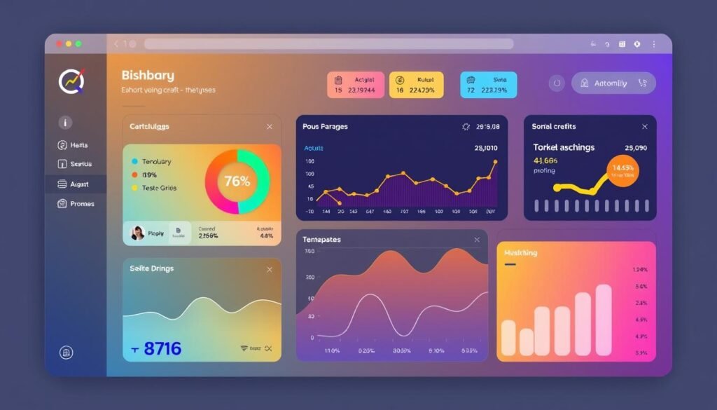
The website dashboard design is key for users to see important performance metrics8. It should show data clearly and in a way that grabs attention. This makes it easy for users to spot trends and get useful insights8. The design must work well on both computers and phones, so users have a smooth experience8.
A great dashboard is simple and easy to understand9. It organizes data in a way that makes sense and puts the most important stuff first. This helps users navigate the dashboard easily9. The Inverted Pyramid method places key info at the top for quick and easy reading9.
Using charts and graphs makes the dashboard more appealing and useful8. These visuals help users understand the data better and make decisions more easily10. A good dashboard balances looks and function, making users happy8.
Designers can use many pre-made dashboard templates to save time10. These templates offer lots of customizable parts, making it easier to create a nice-looking dashboard10. By starting with a good template and customizing it, we can make dashboards that look good and work well10.
The success of a website dashboard depends on how easy it is for users to use9. By focusing on simplicity, clarity, and good data display, we help users make smart choices and find valuable information89.

Building a dashboard for operations, analytics, or strategy follows the same design principles9. By following these principles and using the right tools, we can make dashboards that improve the user experience and help businesses succeed8910.
Layout Techniques for User Engagement
Making a website engaging is all about balance. It needs a design that works well on all devices and a layout that’s easy to follow. A good layout adjusts to different screens, giving users the best experience no matter their device11. Also, a clear and simple structure helps users find what they need fast, which keeps them on your site longer12.
Responsive and Mobile-Friendly Design
Today, most people use mobile devices to surf the web12. So, having a website that changes its look for different screens is key. This makes your site better for everyone, leading to more people sticking around and exploring12. By making sure your site looks great on all devices, you meet your audience’s needs and improve their experience11.
Scannable and Easy-to-Navigate Structure
A good layout is also about being easy to scan and navigate12. Sites with clear paths and organized content let users find what they need quickly12. By following best practices in design, you make your site a joy to use. This leads to happier users and more engagement11.

“A well-designed website layout is like a well-crafted roadmap, guiding users effortlessly through the digital landscape and keeping them engaged every step of the way.” – John Doe, UI/UX Expert
Using Visuals Effectively in Website Section Design
Visuals are key in website design. They help break up content and highlight important info. They also make the site look good and engaging.
Good images and graphics can share a brand’s message. They can also show off products or services. Plus, they grab the user’s attention.
Data visualization, like charts and graphs, is also important. It makes complex data easy to understand. This helps users get the info they need quickly.
Impactful Imagery and Graphics
Choosing the right images and graphics can make a website better. They can draw the viewer in and show what the brand is about. They also help explain important points.
It’s important to pick images that fit with the content. They should be high-quality, relevant, and load fast. This makes for a better user experience.
Data Visualization and Charts
Using charts and graphs can make complex data easy to see. Images are processed faster than text, making them key for user experience.13 The right visuals can help users understand data quickly. Choose the most efficient visualization to avoid wasting time.14
Keeping the design consistent helps users understand better. This makes it easier for them to make informed choices.
To make a website section great, use visuals well. Include impactful images, graphics, and data visualizations. This will improve the user experience, increase engagement, and share your message better.
Optimizing Website Section Design for Usability
Making a website easy to use is key for a good user experience and meeting business goals. We need to check the layout, navigation, and how content is organized often. Usability testing, user research, and using data help us make the design better.
Responsive and mobile-friendly design is very important. About 55% of users use mobile devices to access the web15. Making sure the website works well on different devices helps keep users engaged and improves search engine rankings.
Website speed is also vital for user satisfaction. Faster websites lead to more people staying and coming back15. Using content delivery networks (CDNs) can make websites load faster globally15.
Good information architecture and content organization are also important. A well-designed website can attract more visitors and help businesses grow15. Using header tags, meta tags, and good typography makes websites easier to read and understand15.
Usability testing and user research help us find what needs to be improved. By testing and analyzing user behavior, we learn how to make the website better16.
Staying focused on making things better is important. We can use A/B testing and user acceptance testing to improve the design. This approach, based on user data, helps us create websites that meet customer needs and help businesses succeed16.

By focusing on usability and design that puts users first, we can make websites that are easy to use. This leads to trust, engagement, and helps us meet our business goals.
Testing and Iterating Website Section Designs
Creating engaging website section designs is a never-ending task. It needs regular testing and improvement. Usability testing and analytics reporting are key tools for us. They help us find ways to make our website sections better.
A/B Testing and User Research
A/B testing lets us compare different designs. It helps us find out which ones work best for our users17. We also do user research through interviews and studies. This gives us a deeper understanding of what users like and how they behave17.
This research helps us make smart choices and improve our designs.
Analytics and Performance Tracking
It’s important to watch website analytics and performance metrics closely. This way, we can see how our design changes affect things17. By looking at data like user engagement and conversion rates, we can make our website sections better for users18.
The design cycle for dashboards has five steps. We develop a section, show it to users, test and get feedback, analyze, and then improve17. This cycle helps us keep making our designs better and more user-friendly.
By using A/B testing, user research, and data, we make sure our designs are both good-looking and functional17. This way, we create websites that are not just pretty but also easy to use. This approach helps us make websites that work well and meet our business goals.
“Usability testing is not a common practice in internal KPI dashboard projects, as dashboards are normally intended for specific departments or top management, sometimes with a user base of as few as 10 people.”
Best Practices and Examples of Engaging Website Section Designs
Exploring website section design, we look at top practices and examples. These show how big names have designed their sites. They use responsive design, visuals, clear info, and data to engage users.
Responsive layout is key. It makes sure websites work well on all devices. This boosts the user interface19 and makes sites more accessible19.
Data visualization is important. It makes complex info easy to see and understand19. Good examples include interactive charts and infographics that give quick insights.
| Dashboard Type | Purpose | Key Features |
|---|---|---|
| Operational | Real-time data tracking | Defined key metrics and KPIs, minute-level data updates |
| Strategic | Comprehensive business overview | KPI monitoring over specific periods, data-driven decision-making |
| Analytical | Insights and forecasting | Qualitative and quantitative data analysis, problem-solving |
Usability testing is vital. It checks if the site is easy to use19. Getting feedback from users helps make the site better.
Using these tips, businesses can make sites that stand out. They can share their brand and help users find what they need1920.
“The effectiveness of a strategic dashboard is highlighted by its ability to provide a complete business overview over a specific period, aiding in wise decision-making based on long-term data.”20
Conclusion
Making good website section designs is key for a smooth user experience. It also helps businesses meet their goals and stand out online21. By following rules like clarity, simplicity, and consistent branding, sites can grab users’ attention. They can also share important messages and guide users to take action22.
Testing and improving designs based on data is important. This way, websites can always meet what users want and need22.
Good website design, layout, and usability testing are vital for success2122. A well-designed site can help businesses grow by connecting with people, showing off what they offer, and boosting sales.
In India, following good design principles can make digital experiences better. It can also strengthen a brand and keep it ahead in the fast-changing online world2122. As we keep up with online trends, knowing how to design great website sections will be key for businesses to succeed.
FAQ
What are the key elements of an effective website section design?
What are the principles of effective website section design?
Why is the website dashboard design important?
How can website section design engage users?
How can visuals be used effectively in website section design?
How can website section design be optimized for usability?
How can website section designs be tested and iterated?
Source Links
- Best Website Dashboard UI Examples for Design Inspiration – https://medium.com/theymakedesign/best-web-design-inspiration-dashboards-d87015ffb711
- Top 20 Dashboard Designs Example and 8 Best Practices – https://www.onething.design/blogs/dashboard-design/
- Dashboard Design: best practices and examples – https://www.justinmind.com/ui-design/dashboard-design-best-practices-ux
- Dashboard Design: 7 Best Practices & Examples – https://www.qlik.com/us/dashboard-examples/dashboard-design
- Key UI/UX design principles for effective dashboard design – https://www.aufaitux.com/blog/dashboard-design-principles/
- Dashboard design best practices – 4 key principles – https://www.sisense.com/blog/4-design-principles-creating-better-dashboards/
- Learn 25 Dashboard Design Principles & BI Best Practices – https://www.rib-software.com/en/blogs/bi-dashboard-design-principles-best-practices
- Top 23 Free Dashboard Design Examples, Templates & UI Kits for You – https://www.mockplus.com/blog/post/dashboard-design
- Dashboard Design — Best Examples and Ideas for UI Inspiration — Halo Lab – https://www.halo-lab.com/blog/dashboard-design-examples
- 30+ Open-Source and Free Dashboard Templates – https://www.creative-tim.com/blog/web-design/free-dashboard-templates/
- Dashboard UI Design: 14 Best Practices for Stakeholders | Adam Fard Studio – https://adamfard.com/blog/dashboard-ui
- Using Dashboard Design Patterns To Increase User Engagement – https://community.sisense.com/t5/product-and-website-news/using-dashboard-design-patterns-to-increase-user-engagement/ba-p/20105
- 8 Essential Dashboard Design Principles for Effective Data Visualization – https://medium.com/@mokkup/8-essential-dashboard-design-principles-for-effective-data-visualization-40653c5fd135
- Effective dashboard design | A step-by-step guide | Geckoboard – https://www.geckoboard.com/best-practice/dashboard-design/
- Website Design Optimization Essentials: The Must-Have Components for Exceptional Websites | VWO – https://vwo.com/website-optimization/website-design-optimization/
- UX Optimization – 4 Steps to Deliver a Better User Experience – https://uxcam.com/blog/user-experience-ux-optimization/
- Engaging Your Dashboard Users through User Testing – https://medium.com/nightingale/engaging-your-dashboard-users-through-user-testing-df786d5afc65
- The Ultimate Guide to Website Analysis (With Examples) – Invesp – https://www.invespcro.com/blog/website-analysis/
- Top 10 Dashboard Design Examples – https://arounda.agency/blog/top-10-dashboard-design-examples
- Top 23 Dashboard Design Examples and Practices – https://denovers.com/blog/top-dashboard-design-examples-and-practices/
- Performance Dashboard Design: 7. Conclusions and Recommendations | Saylor Academy – https://learn.saylor.org/mod/book/view.php?id=66752&chapterid=60413
- 10 Data Dashboard Design Best Practices [Trends for 2022] | Aspirity – https://aspirity.com/blog/dashboard-design-overview
